mStable - Brand Refresh
Brand refresh and visual system redesign for mStable DeFi protocol.
Industry
DeFi
Client
mStable
Year
2022
Project overview
mStable is a decentralized finance protocol built around the concept of stability and composability. As the product ecosystem evolved, the brand required a clearer and more cohesive visual identity—one capable of communicating trust, structure, and maturity in an increasingly complex DeFi landscape. This project focused on refreshing the brand’s visual language while preserving continuity with its existing identity.
The Challenge
Defining a cohesive visual architecture rather than isolated graphic assets
Creating a flexible visual system that could scale across products and touchpoints
Ensuring long-term scalability across evolving products and initiatives
Brand direction
The brand direction aimed to balance technical credibility with visual clarity, reinforcing mStable’s role as reliable infrastructure rather than speculative experimentation.
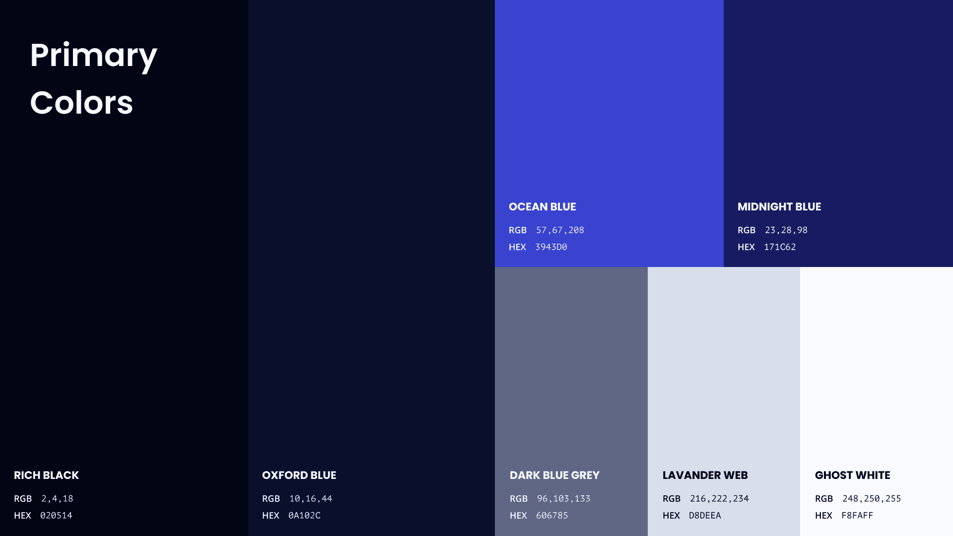
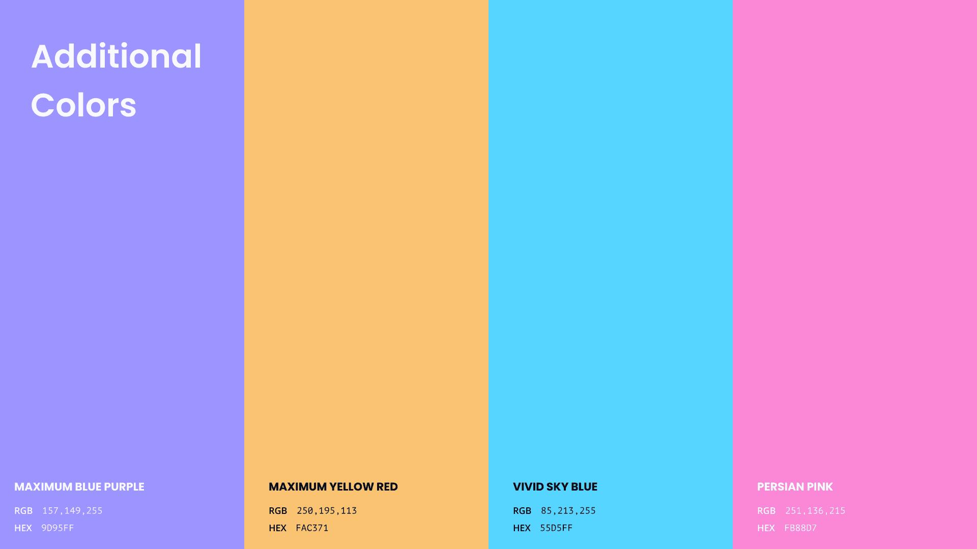
A refined color palette was defined to communicate calm, balance, and reliability, while remaining flexible enough to support different product contexts.
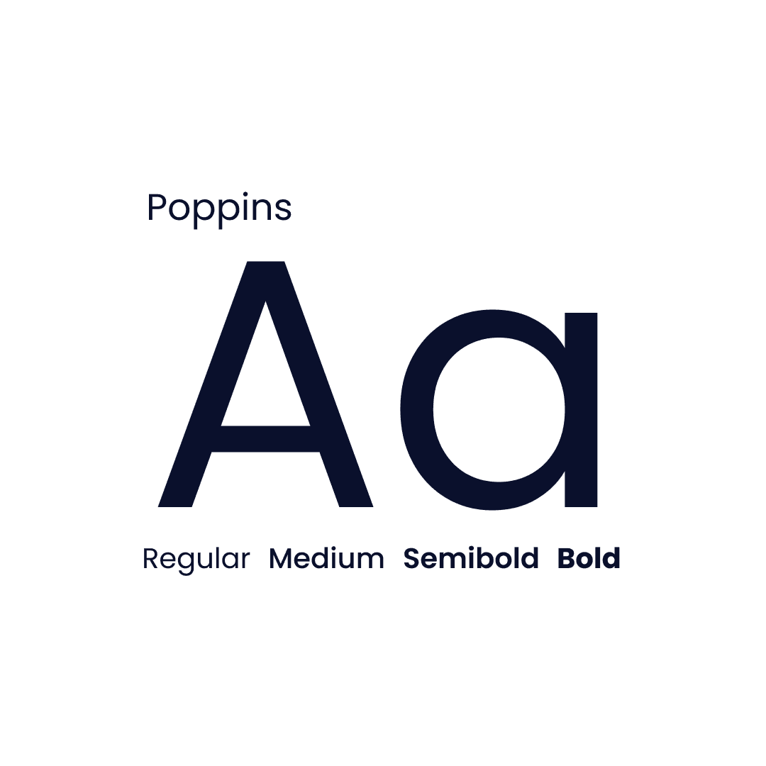
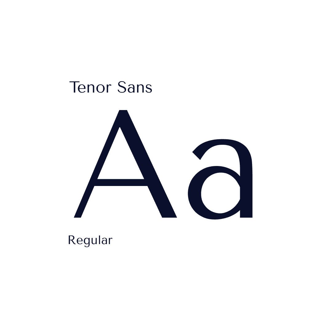
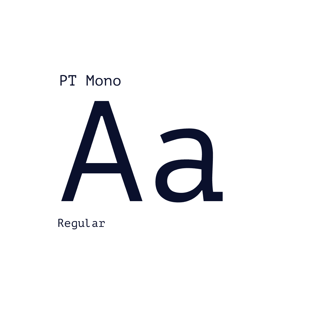
Typography was selected to reinforce clarity and hierarchy, supporting both technical content and broader brand communication.
Abstract shapes and gradients were introduced as modular visual elements, designed to scale across digital and physical applications while maintaining a coherent identity.

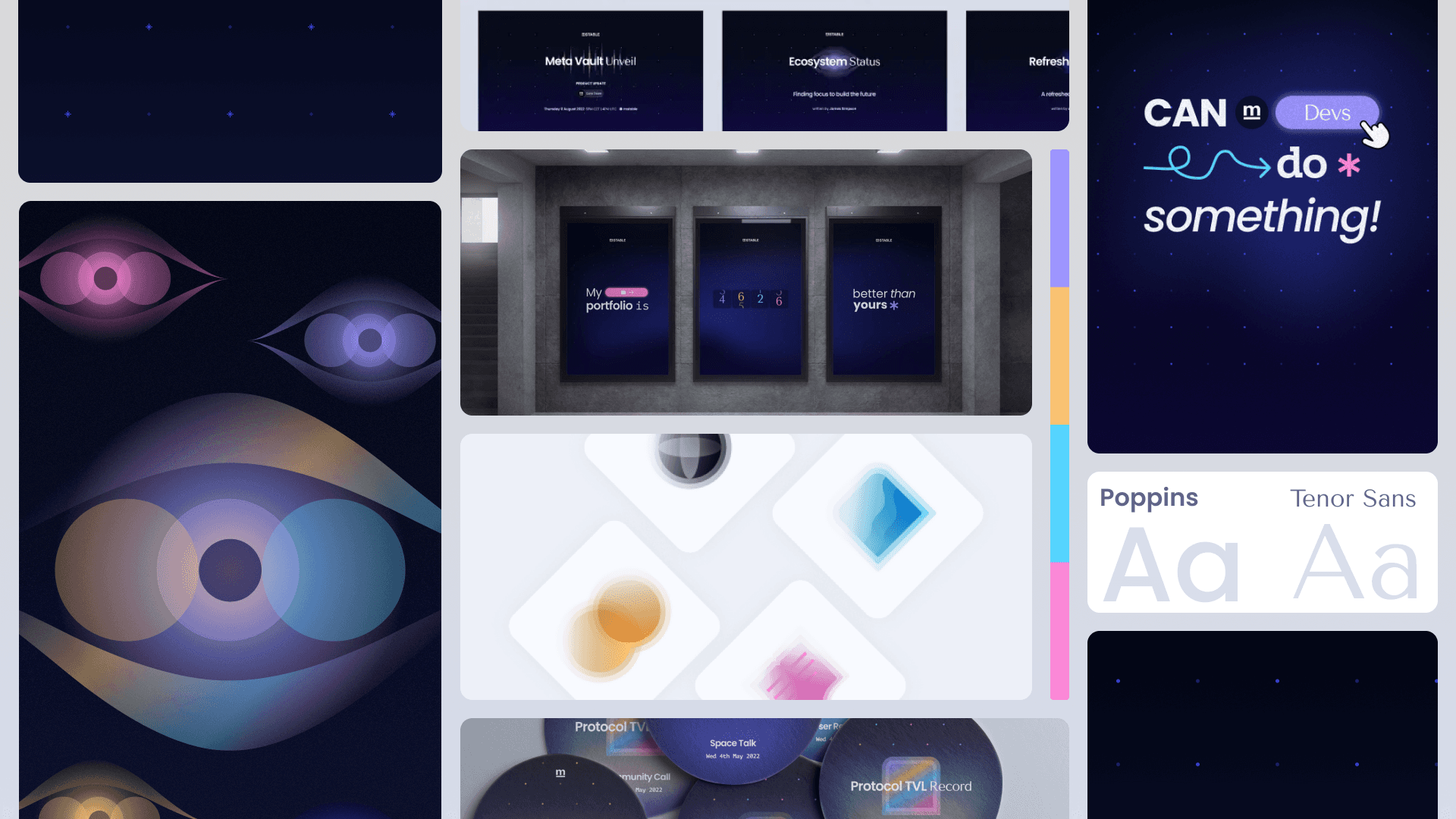
Brand system
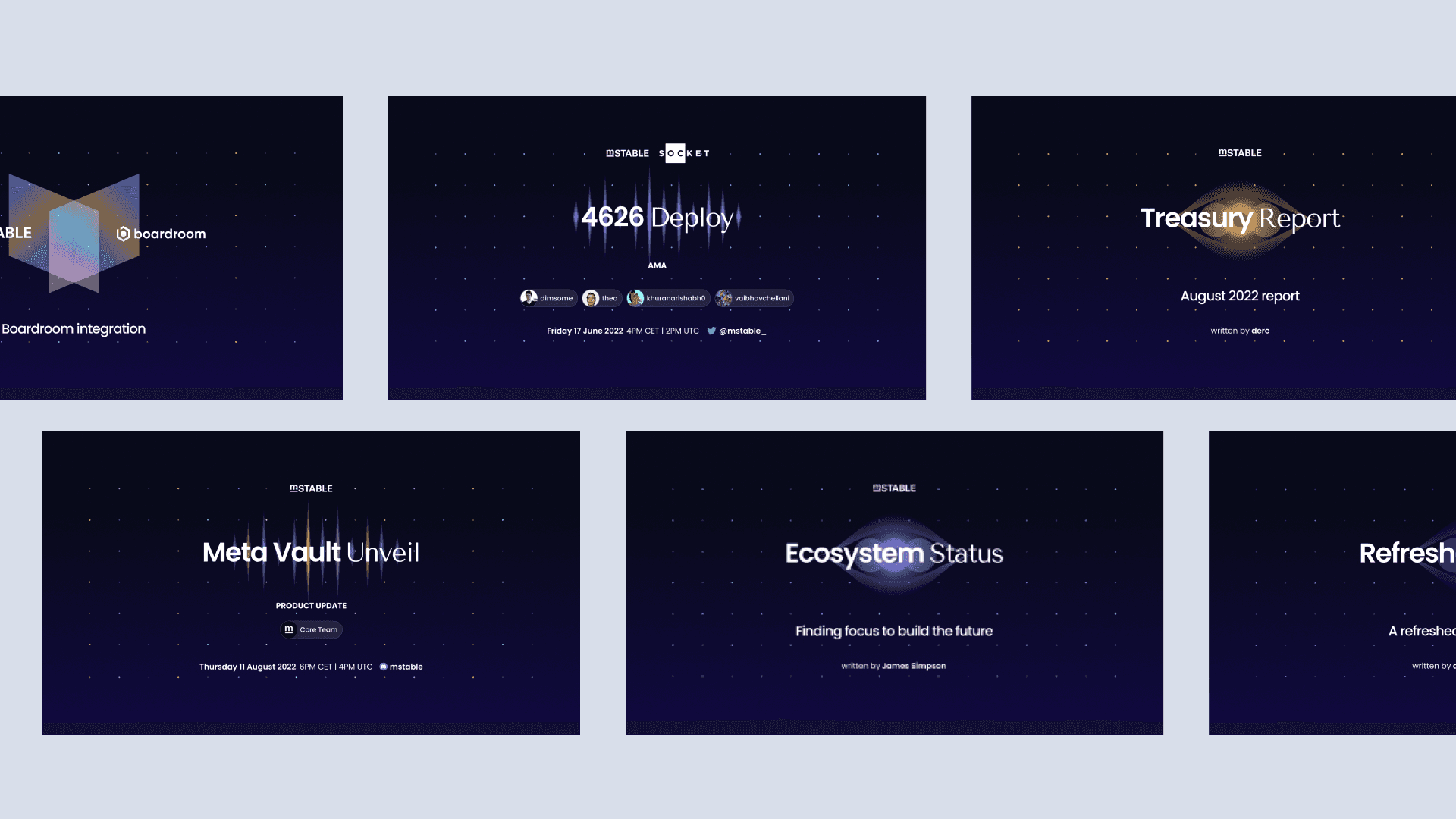
The refreshed visual system was designed to work consistently across multiple touchpoints, from product interfaces to marketing and community-facing materials.
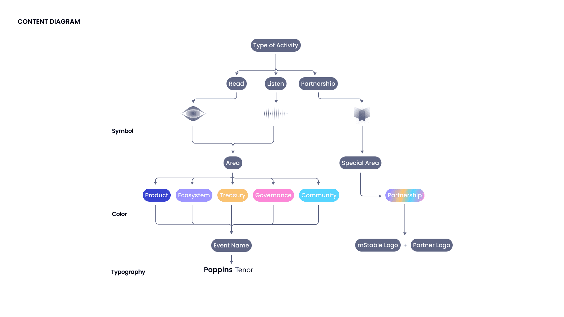
Content architecture & communication system
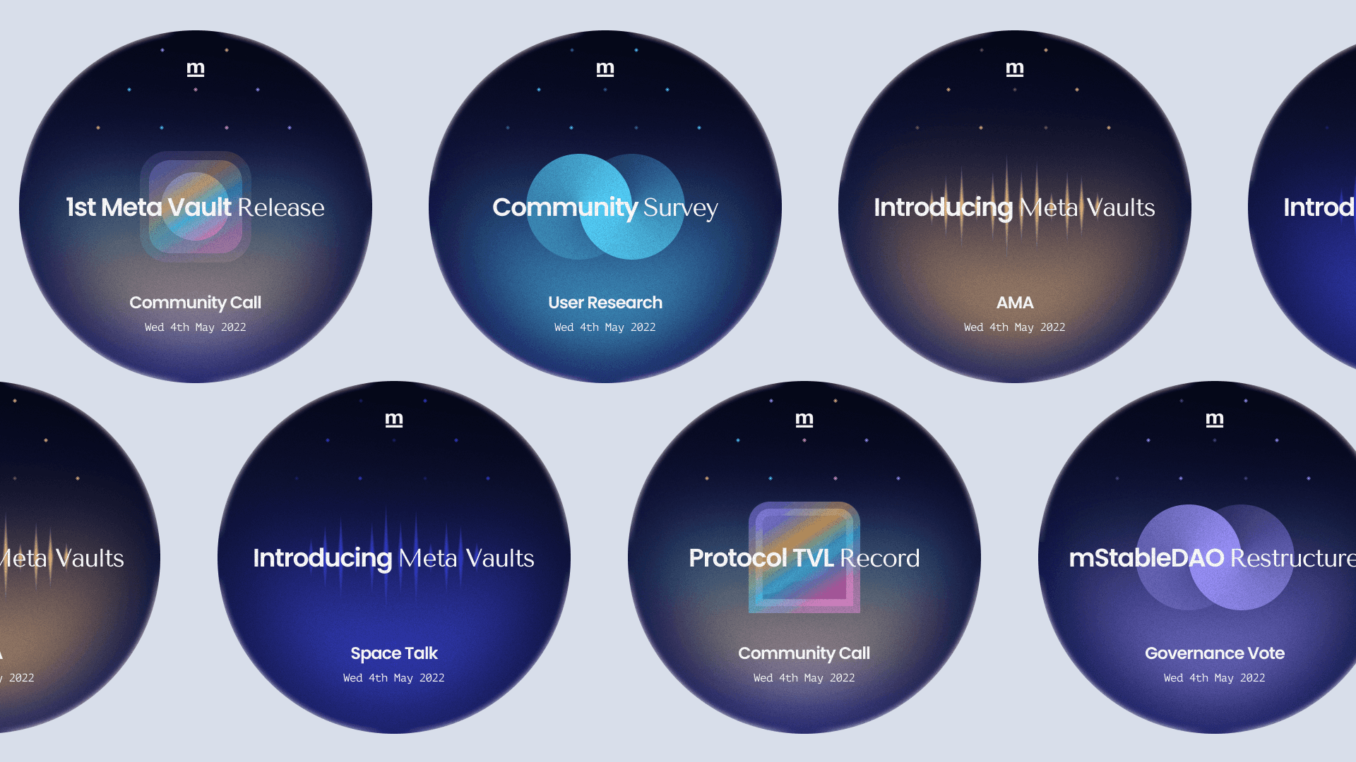
A content diagram was created to organize communication across different activities and areas. Each category was translated into a visual layer within the brand system, supported by color coding and structured typographic hierarchy. This approach reinforces clarity while allowing the identity to scale across diverse communication formats.
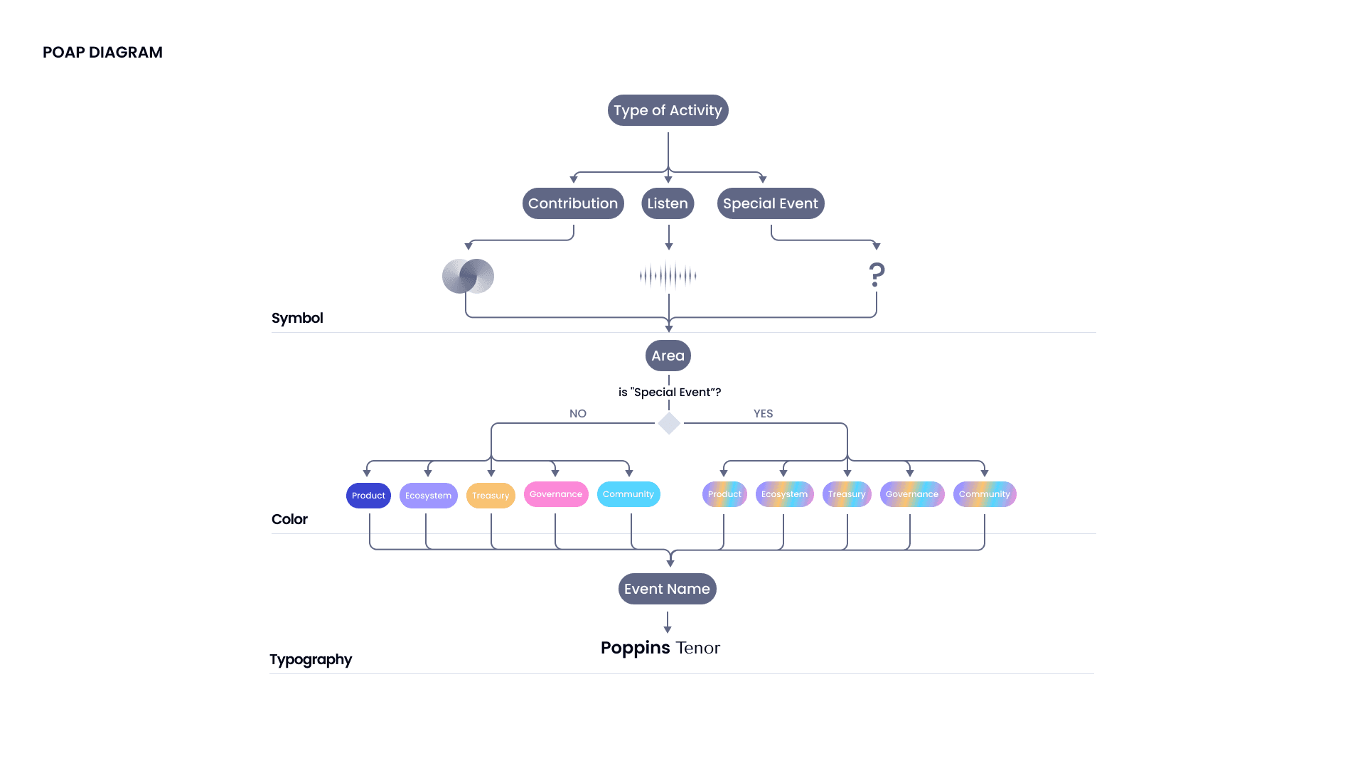
Community rewards — POAP system
Community rewards were designed as an extension of the brand system through collectible POAPs. These assets celebrate participation and protocol milestones while reinforcing visual consistency across the ecosystem. Each POAP follows the same structural logic defined in the content system—shared symbols, color coding, and typographic hierarchy—ensuring coherence with banners and communication materials. At the same time, flexibility was essential. The system allows for variation across events and categories, keeping collectibles visually engaging while preserving a unified identity.
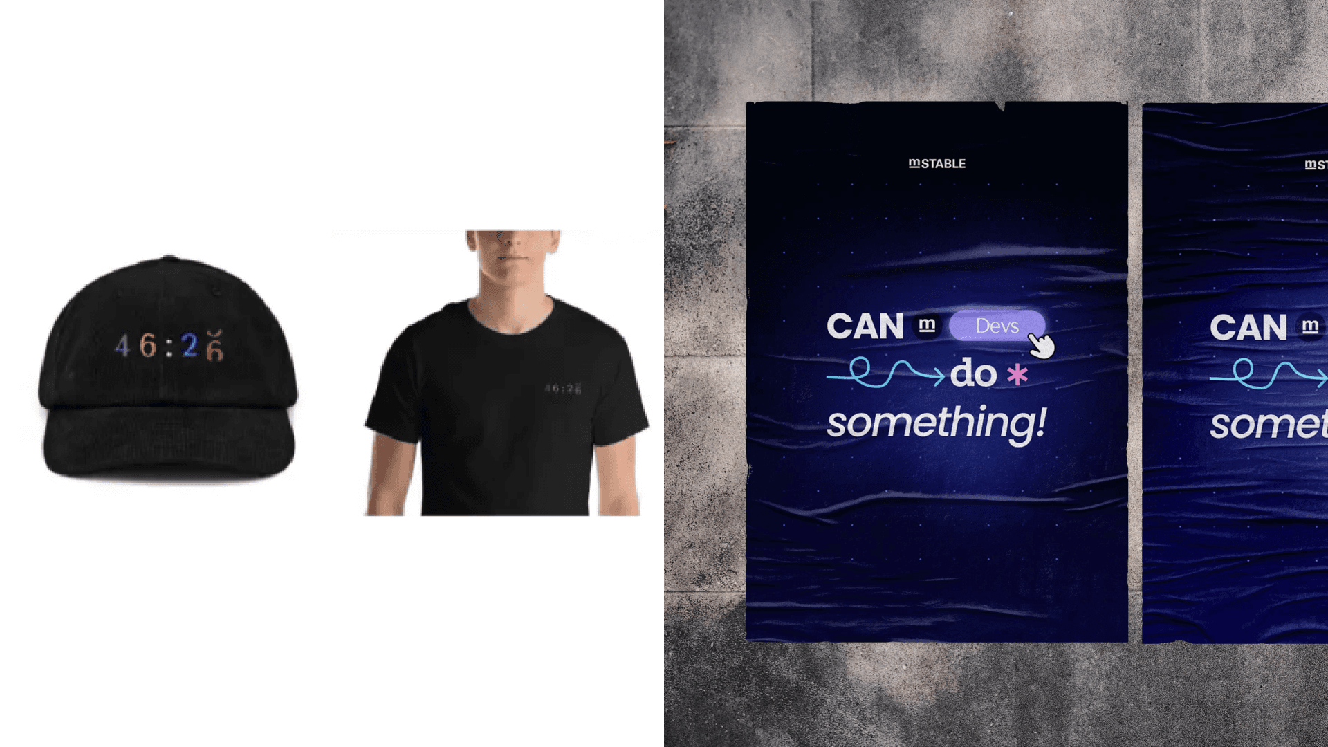
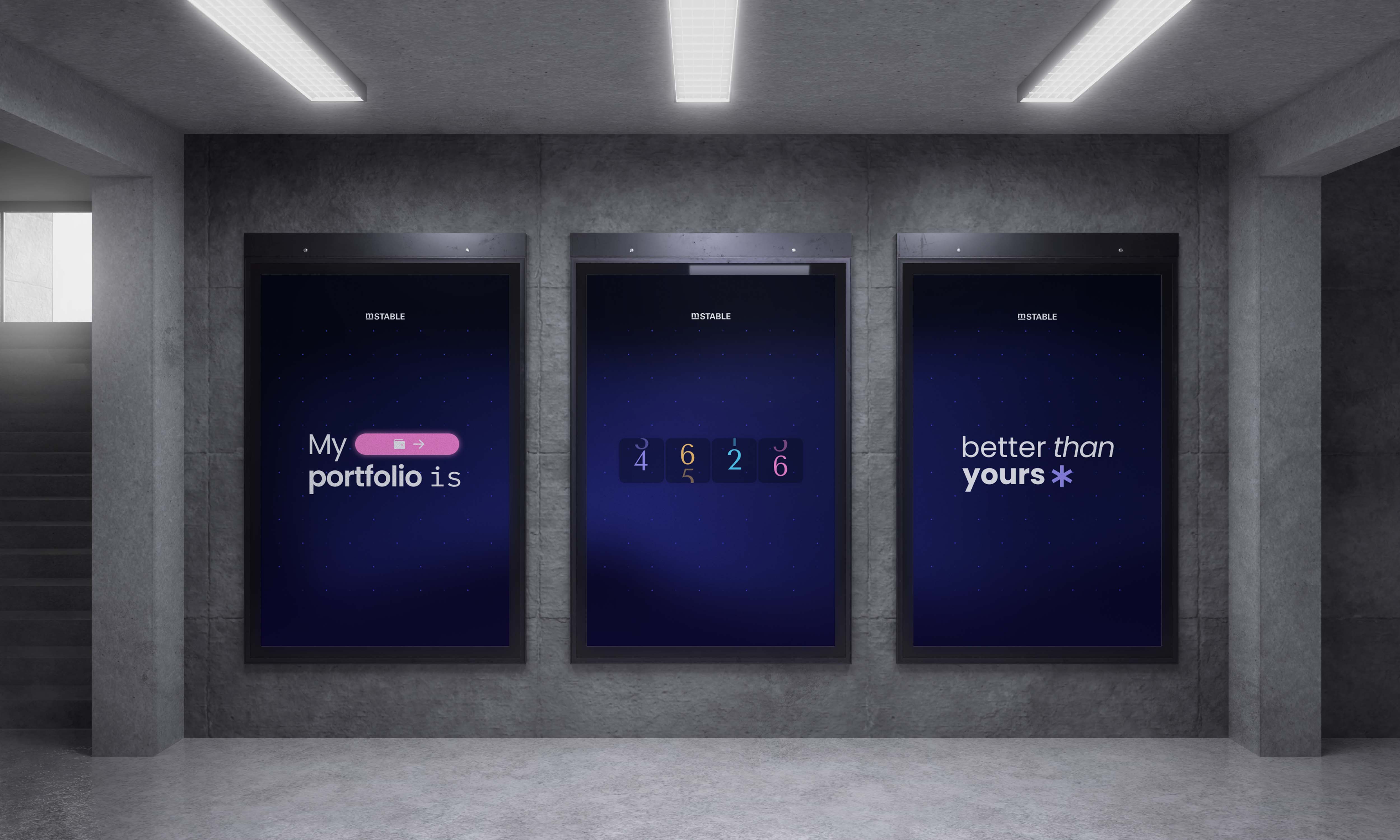
Brand system in physical and cultural contexts
The visual system extends into posters and merchandise, demonstrating its flexibility and coherence across different formats. Core symbols, color coding, and typography scale consistently from digital interfaces to physical applications.